Pages

Showing posts with label editing. Show all posts

Sunday, February 24, 2013

How to make planets in Photoshop

I found a bunch of really awesome tutorials on how to make planets in Photoshop. I think some of these can be applied in Gimp too, and I will try some of them later, probably posting some of the results here.
The problem with Gimp is that it doesn't have an advanced layer blending options like Photoshop does. For example, you have to rely on a filters to apply shadows, which is destructive editing. In photoshop, you can adjust or turn off the shadow anytime!
Most of the tutorials use a texture, but I've seen some that make use of the filters to generate a planet-looking surface.

Here's the first one. It should be enough to guide you, it's universal and with some creativity you can extend the notions learned to create even more awesome images ( right-click and then select "View Image" to view it fullsize):

How to make planets in Photoshop
This tutorial was created by Dinyctis, on deviantArt.

Another tutorial by the same author is about making planetary rings to spice up your planets.

This is a video tutorial on the same subject, yet this time the outcome looks like a space movie poster:


Make a realistic Star Field! Although, I doubt they looks like this in reality... you can check Hubble Ultra Deep Field for a comparison :).

Create a meteor impact with a planet.


And finally, create an absolutely goergeous looking SuperNova:
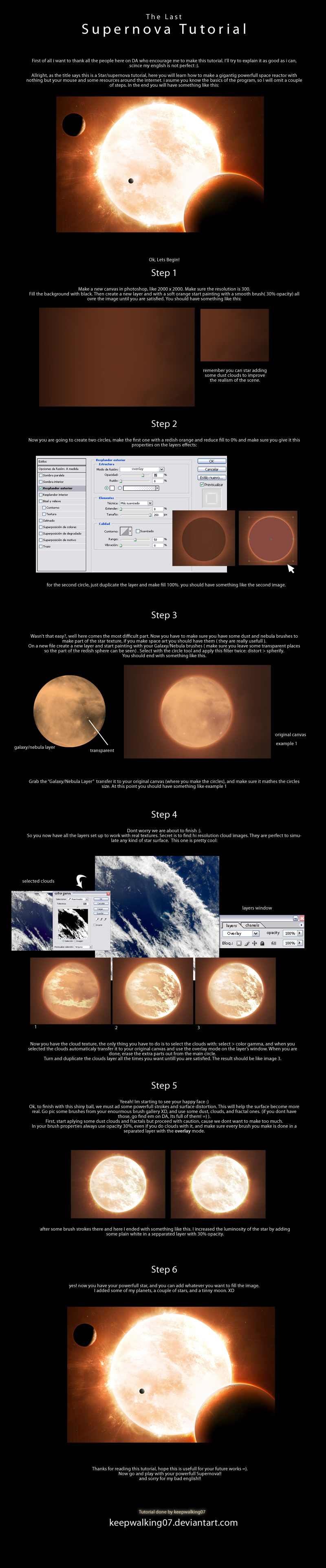
Tutorial link.

These should be enough to make a you a space artist! Happy editing ;).

Saturday, August 13, 2011

Create a glassy frame with Gimp

We often store our digital photos as they are, not enhanced or modified or something. We do this with glossy-paper photos as-well, but we put most of them in albums, and in special cases, we put them in a frame. Well, nowadays it's the era of digital frames which can change the photo now and then. And they're quite cool for showcasing your work to visitors of family :)

But let's talk about making a frame on a photo, using Gimp. First of all, load your photo in Gimp. I used one that I downloaded from http://www.sxc.hu. Apply the desired enhancements.

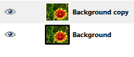
Then duplicate the layer.


 After that apply some Gaussian Blur to it with a value of 60(that's what worked on my image).

There are more ways of creating a frame from this point, you'll just have to use your creativity. The one I'm going to show you is just a simple method, you can find other means of doing this.

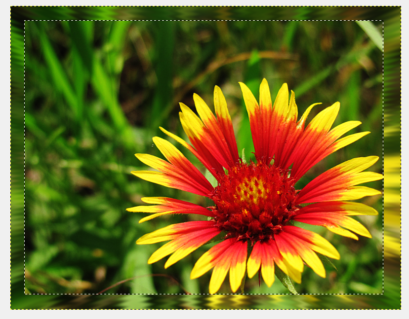
Select your duplicated layer and go to Filters>Distorts>Ripple and here you can play a bit with the values to get a desired effect. For Edges, select "Smear". For the values I choosed: Period 35, Amplitutde 15 and Phase shift can be just any number, like 0. Other options should remain unmodified. Hit Ok.


 Next, go again to Filters and then Distorts>Lens Distortion. Input -50 to Main. Hit Ok.


Pick your rectangular selection tool, and make a selection that will be deleted so that the remaining part will enough for your frame( hit enter after you made it so the editing handles will disappear). Press Delete. At this point, if the deleted section becomes white, it means that your layer doesn't have an alpha channel. Undo the delete, go to Layer>Transparency>Add Alpha Channel. Then hit Delete.


Now pick the selection tool again and change the mode to "Substract" (the third button). Make a selection so that only a thin line of selection remains around the frame. Hit enter to get rid of the modifiers on the selection. Next, get your Gradient tool and select a desired gradiend from the list, leaving the shape to "Linear". Drag across the image to fill the outline of the frame. You can deselect now.


Your image is finished, and it can be saved to the desired format. Have fun experimenting with other types of filters to achieve a more interesting frame!

Monday, August 8, 2011

Make that subject shine!

Do you wonder sometimes about emphasizing a bit the atmosphere of a picture, and make the subject look a bit more "angelic"?

I'll teach you how to do that in this tutorial, using GIMP.

Choose a picture with somebody you want to modify. Take notice that this technique doesn't work well on all pictures. For the picture, I've chosen one that I downloaded from http://www.sxc.hu,
a free stock images site.

Duplicate the layer, and then desaturate it(Colors>Desaturate).

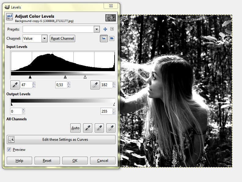
We'll have to increase a bit the contrast, so adjust the color levels to do so(Colors>Levels).
 Now apply some Gaussian Blur (Filters>Blur>Gaussian Blur). A value of 65 seemed to work fine on this particular photo.

Because the blurring decreases a bit the contrast, we'll have to amplify it a bit more again. It's not compulsory to use the Levels tool, you can adjust the contrast with Color Curves as well.

Next, set this layer mode to Overlay.

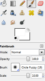
Select a white soft brush, turn the scale up to 10.....

...and then start carefully painting on the blurred layer to "reveal" our subject even more.


Make a new layer(Layer>New Layer), take your soft brush again, but this time change the color to something gold-like. 

Draw an outline on your subject.


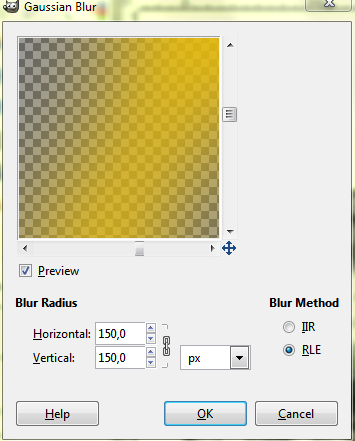
Now apply some Gaussian Blur to this layer. Pick a high value. In my case, I picked 150.


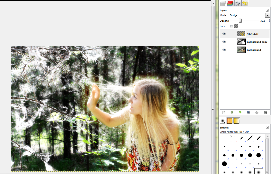
Set this layer mode to Dodge, and reduce the Opacity to 35%.


We can now make the final adjustments to the color of this image. There are 2 ways to do this. The faster is to just Colorize the desaturated overlay layer.


But in my opinion it's more convenient to select the first layer, and change the colors using Color Curves.

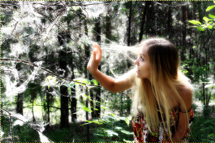
This is the final image:


Have a nice day!

Sunday, July 31, 2011

Default Resolutions Chart

This is a quick chart that's very useful when you have to know the destination of your images- create different versions of the same image so it will be compatible with most of the popular resolutions.

One example of this is when making a wallpaper, but you want it to be compatible with both the squarish and widescreen aspect ratios(5:4, 16:9). And it's useful if you want to scale the things up a bit.


Found it on my computer, and don't remember where I got it. Probably on Wikipedia.

Also, for a more complete list of default resolutions, check this table on wikipedia.

I'm am going to post the most popular 16:9 resolutions here though, I think they're useful enough to be interesting to everyone.


NameWidth x HeightAspect RatioNumber of pixels
720p1280 x 72016:9921,600
WXGA, max. (standardized HDTV 720p/1080i displays)1366 x 768~16:91,049,088
900p1600 x 90016:91,440,000
HD 1080 (1080i, 1080p)1920 x 108016:92,073,600
QWXGA, 2K2048 x 115216:92,359,296
WQHD (Dell UltraSharp U2711, Apple iMac)2560 x 144016:93,686,400
QFHD3840 x 216016:98,294,400
4K4096 x 230416:99,437,184
UHDTV(speculated time frame is 2016-2020)7680 x 432016:933,177,600

Tuesday, June 14, 2011

Spice up that contrast!


So you're trying to make some good looking photos, but really all of them look bland and boring? Sure, you took into consideration several factors to make your scene look better, but still... the colors seem washed. It's ok- it happens with most entry-level photography tools. They're not designed for professionals, but for enthusiasts. I'm going to make a short and comprehensible tutorial about rapidly enhancing the look of your photo using Gimp. The current stable version as I'm writing this is Gimp 2.6.
Wait, I have to drink a glass of water first. Making a tutorial ain't so easy! ...phew, now that I calmed my thirst, let's start this! Here's a close-up photograph of some rocks I took recently:


It surely looks quite bland. What can we do? Well, the first step is to load it into Gimp. Select the background layer and then click Layer>Duplicate Layer(Shift+Ctrl+D)
Let's make this duplicated layer black&white by going to Colors>Desaturate,  choose Luminosity and click OK. Set this layer mode to Overlay and reduce its opacity to about 50% or around some satisfactory value(we want this effect to be subtle, not to scratch our eyes).
We should also increase a bit the sharpness of our image. To do this, select the background layer,  then go to Filters>Enhance>Unsharp Mask. A Radius=5, Amount=0.5 and Threshold=0 seems to work fine on this particular image. You can fine-tune these parameters, but remember: you always want the effect to be subtle, else the you're effectively damaging the image.


The image is now looking like this:


Basically, we can already save it as it is, it's looking much better than the original. You may be tempted to say it's not, but switching back to the original you'll have a sensation of looking at it through fog...

Let's continue making this photo more interesting!
When I took the shot, I forgot the EV(exposure value) at -0.7, so it's a bit underexposed. Let's profit from this by emphasizing a bit the whites, particularly the bigger white rock. Duplicate the background layer again and move it up(so it's at the top). Go to Filters>Blur>GaussianBlur. Type in a value of 100 and click OK. Set this layer mode to Dodge, with an opacity of about 50-55. To eliminate the possible "too saturated" blurry edges(it's happening on the white rock in this image for example), go to Colors>Desaturate and choose Luminosity to make this layer b&w too. So now we have this:


Now it all depends on your imagination. Would you like to alter the colors or make them more intense? Select the background layer and then go to Colors>Curves and start messing around until you are satisfied. I came up with this: 


(I usually enjoy warmer pictures. I rarely opt for 'cold' colors)

Perhaps you enjoy monochrome images? With the background layer selected, go to Colors>Colorize. Again, fine tune the parameters remembering to make the effect have a subtle impact on the final image. Particularly, reduce the saturation a lot.


 (this looks green and... cold... *sneezes)
Let's try something different this time. Desaturate the background layer( I hope you know how to do it now). Select the Blend Tool(or gradient tool, by pressing L). Set its mode to Overlay and then choose a gradient from the available ones(or you can create one of your own, but the list is quite enough for our purposes). You have to experiment with the Opacity on this one, as different gradients will look better with different values.
For example, I chose the Golden gradient, with an opacity of 70, a Linear shape and dragged from bottom to top:
(now I don't want to hear somebody saying this has the color of puke, because I think it is elegant! Allright? :) )


Or you can go totally wild and do something like this:


(Notice how we completely ignored being subtle here :)... uhm, is that a double rainbow? :O)


Well, what can I say? Editing is a lot of fun! So have lots of it! ;)